

Your Website Isn't the Problem. Your Conversions Are.
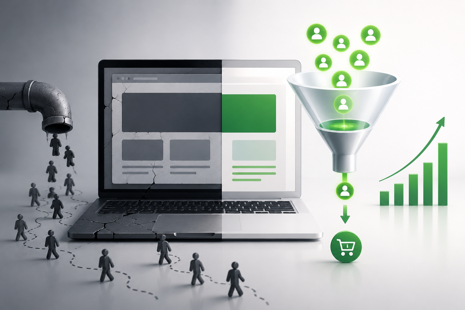
Most people decide whether they'll stay on your website in less than 10 seconds. That's not a guess. Researchers at Microsoft studied real visitor behavior and found that most web pages get judged in the first 10 seconds. The first impression itself forms in about 0.05 seconds, before a visitor has even read a word. Here's what that means for your business: your website has less time to make a first impression than it takes to read this sentence. Most business owners respond to poor sales by blaming the website. "It looks outdated." "We need something modern." "Let's redo the whole thing." But a new coat of paint doesn't fix a leaky roof. A redesigned website doesn't fix the real problem, which is usually much simpler: visitors don't know what to do once they land on your page. This article breaks down exactly why visitors leave, what a high converting website actually looks like, and how to fix your current site instead of starting over.
Quick Win: Before you read another word, open your own website on your phone right now. Can you tell, in 5 seconds, what the business does and what to click? If not, you already found your first problem.
Why Visitors Leave in Under 10 Seconds
Think about the last time you landed on a website you didn't recognize. What made you stay? What made you leave? You probably didn't read the whole page. You scanned it. Your brain was asking three questions almost instantly: What is this? Is it for me? Can I trust it? If the answers aren't obvious immediately, most people leave. This isn't laziness. It's how attention works online. The average internet user visits well over 100 pages a day. Nobody has the patience to figure out a confusing page when the next tab is one click away. Cognitive overload makes this worse. When a homepage has five headlines, three offers, a pop up, a slider, and a chat bubble all competing for attention at once, the visitor's brain doesn't know where to look. Confused visitors don't convert. They leave. Research from the Nielsen Norman Group backs this up. The first several seconds on a page are the riskiest moment in the entire visit, because that's when people decide, almost unconsciously, whether the page is worth their time.
Pro Tip: A visitor doesn't need to love your website. They just need to instantly understand it.
Too Many Choices
Here's a mistake almost every small business website makes. It tries to do everything at once. The homepage has a navigation menu with 10 links. Then three different call to action buttons. Then a phone number, a contact form, and a chat widget, all above the fold. This feels helpful. It's actually the opposite. Psychologists call this analysis paralysis. When people are given too many options, they often make no decision at all, rather than sit down and compare them. On a website, "no decision" means the visitor closes the tab. Example: A dentist's homepage that offers "Book Now," "Call Us," "View Services," "Read Reviews," "New Patient Special," and "Insurance Info," all as equally sized buttons, gives the visitor six things to think about before they've even decided if they want an appointment. Compare that to a homepage with one clear headline, one clear photo, and one clear button: "Book Your Free Consultation." Nothing else competes for attention.
Simplifying a page doesn't mean removing information. It means putting one primary action front and center, and letting everything else live one scroll down or one click away. Cluttered HomepageSimplified Homepage6+ competing buttons1 primary call to actionLong navigation menu4 to 5 clear menu itemsMultiple offers at onceOne core offer, clearly statedVisitor has to thinkVisitor knows exactly what to do
Weak Headlines
Your headline is the first thing a visitor reads. If it doesn't answer three questions instantly, you've already lost them:
What do you do?
Who do you help?
Why should they care?
Most small business headlines fail because they talk about the company instead of the customer.
Bad headline: "Welcome to Smith & Sons Plumbing. Family Owned Since 1987."
This tells the visitor about the company's history. It says nothing about what the visitor needs right now.
Good headline: "Same Day Plumbing Repairs in [City]. No Overtime Fees."
This headline answers all three questions in one line. It's specific. It's about the customer's problem, not the company's backstory.
Pro Tip: If your headline could apply to any business in your industry, it's too generic. A strong headline should only make sense for your business.
No Clear Call to Action
Here's something that surprises a lot of business owners. Most visitors don't leave because they aren't interested. They leave because they don't know what to do next.
A website without a clear call to action is like a store with no cash register visible. The customer wants to buy, but there's no obvious way to complete the transaction.
Common, effective calls to action include:
Book Now
Get a Quote
Schedule a Consultation
Download the Guide
Call Today
The key isn't just having a call to action. It's having a CTA hierarchy. One primary action should be the clear priority (usually the button with the strongest visual contrast, placed above the fold). Secondary actions, like "Learn More" or "View Portfolio," should look and feel less prominent, so they don't compete with the main goal.
Common Mistake: Putting five different CTAs of equal size on one page. If everything is a priority, nothing is.
Slow Loading Websites
Speed isn't just a technical detail. It directly affects three things that matter to your bottom line.
1. SEO. Google factors page speed into how it ranks websites, particularly through Core Web Vitals, a set of measurements around loading speed, interactivity, and visual stability. A slow site can rank lower even if the content is excellent.
2. Trust. A slow loading page subtly signals that a business doesn't have its act together, even if that's not true.
3. Conversions. This is the big one. Data from Google's own mobile performance research shows that as page load time increases from 1 to 3 seconds, the probability a visitor abandons the page climbs by 32%. Stretch that to 5 seconds, and abandonment jumps by 90%.
Read that again. Just a few extra seconds of load time can cost you the majority of your visitors before they see a single word.
Quick Win: What Slows Sites Down
Uncompressed, oversized images
Cheap or overloaded shared hosting
Too many plugins or scripts running at once
No caching or content delivery network (CDN)
Image optimization alone (compressing photos without losing visible quality) can shave real time off your load speed. But the foundation underneath all of it is your hosting.
A quick note on hosting: if your website is hosted on cheap, overloaded shared hosting, no amount of image compression will fully fix your speed problem. This is one area where paying a little more genuinely pays off. We're fans of Hostinger for small businesses that need fast, reliable hosting without an enterprise price tag. Their entry level plans start under $3 per month and are built on LiteSpeed server technology, which is meaningfully faster than older, traditional shared hosting setups.
If you purchase through our links, we may earn a commission at no extra cost to you.
Missing Trust Signals
Even if a visitor understands your offer and knows what to click, they still have one more question. Can I trust this business?
This is where trust signals come in, the visible proof that other real people have used your business and had a good experience.
Trust signals include:
Customer reviews and testimonials
Google star ratings
Before and after photos
Case studies
Client logos (for B2B businesses)
Certifications or licenses
Money back guarantees
Security badges (especially at checkout)
The data on this is hard to ignore. Multiple consumer research studies (including reporting from BrightLocal's ongoing consumer review survey) show that the vast majority of consumers, often cited north of 90%, read online reviews before choosing a local business. Some research even links displaying reviews to a meaningful lift in conversion rate, and shows that conversion rates tend to climb further once a business has five or more visible reviews.
Pull Quote: "People don't buy from the business with the best website. They buy from the business they trust the most. Your website's job is to prove you're trustworthy, fast."
Pro Tip: Don't bury your reviews on a separate "Testimonials" page nobody visits. Put 2 to 3 strong reviews directly on your homepage, near your call to action, right when the visitor needs reassurance most.
No Follow Up System
Here's an uncomfortable truth. Most visitors won't buy the first time they visit your website.
That's normal. People compare options, get distracted, or aren't ready yet. The businesses that win aren't the ones who convert every visitor instantly. They're the ones with a system to follow up after that first visit.
A real follow up system includes:
A CRM to track every lead and where they are in the decision process
Automated email follow up sequences
SMS reminders for appointments or abandoned inquiries
A website chat widget to capture questions in real time
Simple appointment booking that doesn't require a phone call
Lead nurturing sequences that stay in touch without being pushy
Without this system, every visitor who doesn't buy immediately is a lead you paid to attract and then lost forever.
This is where a lot of small businesses are running five different disconnected tools. One for email, one for texting, one for booking, one for chat, none of which talk to each other. That disconnect is exactly where leads fall through the cracks.
We recommend GoHighLevel for small businesses that want this entire system in one place: CRM, forms, website chat, automation, appointment booking, email, SMS, sales pipelines, reputation management, and built in AI tools, all under a single login instead of five separate subscriptions. Plans start around $97 per month for a single business.
If you purchase through our links, we may earn a commission at no extra cost to you.
You Can't Improve What You Don't Measure
You can't fix what you can't see. Before you change a single word on your website, you need to know how people are actually using it.
Start with these four things:
Google Analytics. Tells you where your traffic is coming from and which pages people leave from.
Heatmaps. Show you exactly where visitors click, scroll, and lose interest on a page.
Conversion tracking. Tells you which specific pages and offers actually turn visitors into leads.
A/B testing. Lets you test two versions of a headline, button, or layout to see which one performs better, instead of guessing.
Keyword research and search intent matter here too. If your website is optimized for the wrong keywords, ones that don't match what your ideal customer is actually searching for, you'll attract visitors who were never going to convert in the first place, no matter how good your page looks.
This is where a tool like Semrush becomes genuinely useful, even for a small, local business. It handles keyword research, competitor analysis, SEO audits, content ideas, ranking tracking, and backlink analysis in one dashboard, so you're optimizing based on real search data instead of guesswork. Plans start around $117 to $140 per month for the entry level tier.
If you purchase through our links, we may earn a commission at no extra cost to you.
What a High Converting Website Actually Looks Like
Here's the checklist. If your website can check every box below, you don't need a redesign. You need to keep doing what's working.
Loads in under 2 to 3 seconds
Clear, customer focused headline above the fold
One primary call to action, visually obvious
Visible trust signals (reviews, ratings, guarantees)
Simple, uncluttered navigation
Fully optimized for mobile devices
A lead magnet to capture visitors who aren't ready to buy yet
A CRM connected to the website to track every lead
A chat widget or easy way to ask a quick question
Fast, reliable hosting
Keyword optimized content that matches real search intent
Simple forms (name, email, phone, nothing more than necessary)
Analytics tracking set up and actually being reviewed
Automated follow up for leads who don't convert immediately
Final Takeaway
Your website isn't broken. Your conversion system is.
The businesses growing fastest right now aren't necessarily getting more traffic than their competitors. They're converting more of the traffic they already have.
That's a fundamentally different problem than "we need a new website," and it's usually a much cheaper, faster one to fix.
Frequently Asked Questions
1. What is website conversion optimization? Website conversion optimization is the process of improving your website so that more visitors take a desired action, like booking an appointment, making a purchase, or filling out a form, without necessarily needing more traffic.
2. Why do visitors leave a website so quickly? Most visitors decide whether to stay on a page within about 10 seconds. If the page doesn't clearly and instantly communicate what the business does, who it's for, and what to do next, visitors leave to find a clearer option.
3. Do I need a new website to increase conversions? Usually not. Most conversion problems come from unclear messaging, missing trust signals, weak calls to action, or slow load times, all of which can be fixed on your existing website without a full rebuild.
4. What's a good website conversion rate for a small business? This varies significantly by industry, but many local service businesses see meaningful results by simply fixing the fundamentals: one clear CTA, visible trust signals, and fast load times. Tracking your own baseline first is more useful than chasing an industry wide average.
5. How does website speed affect SEO and sales? Speed affects both. Google factors page speed into search rankings through Core Web Vitals, and research shows abandonment rates climb sharply as load time increases, meaning a slow site can lose both search visibility and paying customers.
6. What are trust signals, and why do they matter? Trust signals are visible proof that real customers have had a good experience with your business: reviews, ratings, testimonials, certifications, and guarantees. The vast majority of consumers check reviews before choosing a local business, making trust signals one of the highest leverage additions to any page.
7. What should my website's call to action say? It depends on your business, but effective CTAs are specific and action oriented, like "Book Now," "Get a Quote," or "Schedule a Consultation," rather than vague phrases like "Submit" or "Learn More."
8. How do I know if my website actually has a conversion problem? Check your analytics for high traffic paired with low form submissions, calls, or bookings. That gap, traffic without action, is the clearest sign that the issue is conversion, not visibility.
A new website feels like progress. But if the underlying system, the headline, the call to action, the trust signals, the follow up, isn't fixed, a redesign just gives you a better looking version of the same problem.
Start with the checklist above. Fix one thing at a time. Measure what changes.
Ready to see exactly where your website is losing customers? Download our free Website Conversion Checklist below, or reach out to Yes Yes Marketing for a free AI powered website conversion audit. We'll show you precisely where visitors are dropping off and what to fix first.
